Documentation & Support

Welcome to Urge, a premium Shopify theme for OS 2.0. Use our Documentation as guidance to help set up and build your Shopify store using the URGE theme.

  • Follow the Demo Setup Instructions to replicate the look and feel of the URGE 2.0 theme. For further guidance, please see our Theme Customizations and Theme Updates video tutorials.
  • For general guidance with modifying sections and blocks, please refer to the following Shopify documentation, Sections & Blocks · Shopify Help Center.
  • As per our Theme Support Policy, Marketplace Solutions supports all bug fixes and answers any merchant technical questions regarding our theme within two business days.
  • Custom code tutorials in our documentation, such as demo setup instructions, theme customizations, and theme updates, are supported.

Warning

Be sure to duplicate your theme before editing the code. You can do this by accessing the theme library section of your Shopify dashboard. Click the actions dropdown beside your theme and select duplicate.

If you require further assistance such as customizations, app-integrations or theme updates, hire a Shopify Expert for help. (Services are not included in the cost of your theme.)

Still need help? Browse FAQ's or Contact


Support Hours:

Monday - Friday
9:00am - 5:00pm EST (Excluding public holidays)

Theme settings

Configure the theme settings:

  1. Navigate to Customize theme. At the top of the page, click the dropdown to select the Home page template.
  2. Click on Theme Settings on the left sidebar to access theme-wide settings. Settings include:
Color

From here, you can select the colors you want to use throughout the theme. Through this main setting, you perform the following settings:

Primary color

Setting

Description

Background

Theme background color.

Heading

Heading color.

Text

Text color.

Tagline

Tagline color.

Compare price

Compare price color.

Sale price

Sale price color.

Buttons

Button color.

Button text

Button text color.

Lines and borders

Lines and borders color.

Input focus

Focus color for inputs.

Cart count bubble background color

Background color for the cart count bubble.

Cart count bubble text color

Text color for the cart count bubble.

Announcement bar

Setting

Description

Background color

Background color for the announcement bar.

Text color

Foreground color on background colors.

Link color

Color used for links.

Header

Setting

Description

Background

Background color for the header.

Text

Text color for the header.

Text hover

Text hover color.

Transparent background

Transparent background color.

Transparent text

Color for transparent text.

Transparent text hover

Color for transparent text when hovered over.

Topbar background color

Background color for the topbar.

Topbar text color

Text color for the topbar text.

Footer

Setting

Description

Background

Background color for the footer.

Borders

Border color for the footer.

Text

Text color for the footer.

Menu and cart drawers

Setting

Description

Overlay

Menu overlay color.

Overlay opacity

Percentage for the opacity for the menu and cart drawers overlay.

Image treatment

Setting

Description

Overlay

Overlay color used on slideshows, large images with text, and collection list sliders.

Overlay opacity

Overlay opacity - Percentage of opacity for the Image treatment overlay.

Typography

From here, you can make font-related customizations using different options.

Headings

Setting

Description

Font

Select the font for the headings.

Letter spacing

Select the letter spacing for the headings.

Font size scale

Select the font size scale for the headings.

Line height

Select the line height for the headings.

Body

Setting

Description

Font

Select the font for the body text.

Letter spacing

Select the letter spacing for the body text.

Font size scale

Select the font size scale for the body text.

Line height

Select the line height for the body text.

Extras

Setting

Description

Italic Font

Select the italic font.

Navigation letter spacing

Select the Navigation letter spacing.

Navigation size

Select the navigation font size.

Capitalize navigation

Enable/disable font capitalization.

Layout

Setting

Description

Page width

Change the page width of the website (max 1600px).

Enable breadcrumbs

Check/uncheck the box to enable/disable breadcrumbs.

Breadcrumb background color

Background color for breadcrumbs.

Breadcrumb text color

Text color for breadcrumbs.

Color swatch

From here, you can select the colors you want to use throughout the theme. Through this main setting, you perform the following settings:

Setting

Description

Enable color swatches

Check this box to enable the color swatches feature.

Configuration

Enter a color configuration per line using one of the following formats

  1. [Name][:][space][#][6 digit hex color value] 

              e.g., Red: #ff0000

  1. Name: [filename][.][file extension] 

             e.g., Blue: blue.png

Important Note

Each rule must be on its own line.
Product Grid

Setting

Description

Enable quick shop feature

Check/uncheck the box to enable/disable the quick shop feature in the product grid.

Hover to reveal second image

Check/uncheck the box to enable/disable the hover feature in the product grid.

Enable type

Check/uncheck the box to enable/disable the product grid type.

Image ratio

Select a setting from the drop-down for the product grid:

  • Adapt to image
  • Portrait
  • Square
Gift Wrapping

Setting

Description

Enable gift wrapping

Select the checkbox next to one of the following options to enable gift wrapping for all or specific products:

  • All Products 
  • Specific products only

All Products

Enables gift wrapping for all products.

Specific products only

Enables gift wrapping for specific products only.

Exclude specific products

If All products was selected - Select this option if you wish to excludes specific products from gift wrapping when All Products is enabled.

Choose product

Select a gift wrapping product.

Text

Enter Gift wrap item text.

Gift image

Select an image for the gift wrap.

Gift message

Enter gift message text.

Size Chart

Setting

Description

Enable size chart 

Check this box to enable the size chart.

Size chart - page

Select the page to display for the size chart.

Enable custom size chart

Enable to use your custom size chart configured below. Please disable this if you are using Page as Size Chart. 6 sizes can be configured. 

Size - 1

Size

This is the size name e.g. XL 

Length (cm)

Length in cm for this size.

Chest (cm)

Chest in cm for this size.

Shoulder (cm)

Shoulder in cm for this size.

Sleeve length (cm)

Sleeve length in cm for this size.

Size -2, 3, 4, 5 & 6

See settings descriptions for Size -1 above.

Back to Top Button

Setting

Description

Enable back to top button

Check the box to enable this feature.

Text and icon color

Text and icon color for the back to top button.

Background color

Background color for the back to top button.

Cart

Customize the look and feel of the cart drawer using the following settings:

Setting

Description

Cart type

Change cart type to Page or Cart drawer.

Enable Cart Note

Enable this checkbox for cart note.

Terms and conditions enable

Enable this checkbox to display terms and conditions.

Cart additional buttons

Enable this checkbox for additional cart buttons.

Terms and conditions url

Select the terms and conditions url.

Enable free shipping bar

Enables the free shipping threshold feature.

Threshold

Set the threshold to meet for free shipping.

Country/Language selector

Country/region selector

Setting

Description

Enable country/region selector

Select the checkbox to enable the country/region

Language selector

Setting

Description

Enable language selector

Select the checkbox to enable the language selector.

Badges

Setting

Description

Show discount

Check this box to enable the discount feature. 

Discount SVG color

Change the discount SVG badge color.

Discount color

Change the discount badge text color.

Sold out background color 

Change the sold out badge background color.

Sold out color

Change the Sold out badge text color.

Featured background color

Change the featured badge background color.

Featured color

Change the featured badge text color.

Bestseller background color

Change the bestseller badge background color.

Bestseller color

Change the bestseller badge text color.

Social Media

Use this setting to link your Shopify store to your social media handles.

Setting

Description

Twitter

Add the link to your “Twitter” handle.

Facebook

Add the link to your “Facebook” handle.

Pinterest

Add the link to your “Pinterest” handle.

Instagram

Add the link of your “Instagram” handle.

TikTok

Add the link to your “TikTok” handle.

Tumblr

Add the link to your “Tumblr” handle.

Snapchat

Add the link to your “Snapchat” handle.

YouTube

Add the link to your “YouTube” handle.

Vimeo

Add the link of your “Vimeo” handle.

LinkedIn

Add the link to your “LinkedIn” handle.

Search Behavior

Customize search results using the following settings:

Product Suggestions

Setting

Description

Enable product suggestions

Select the checkbox to show/hide the product suggestions in search results.

Show vendor

Select the checkbox to show/hide the vendor in search results. (Visible when product suggestions is enabled).

Show price

Select the checkbox to show/hide the price in search results. (Visible when product suggestions is enabled).

Popular Search

Setting

Description

Placeholder text

Place holder text for the search bar.

Heading

Popular search heading

Text

Additional text to be displayed.

Favicon

These are tiny icons that appear in browser tabs, address bars, and bookmarks menus near your site's url or title. Users can upload favicon icons by clicking on the Change button under the favicon setting.

Setting

Description

Favicon image 

Select an image

Please Note

An image size of 32 x 32px (pixels) is recommended.
Currency format

Setting

Description

Show currency codes

Enable this checkbox to show currency codes. Cart and checkout prices always show currency codes. Example: $1.00 USD.

Checkout

With these settings, you can change the look and feel of the checkout page.

Setting

Description

Banner

Background image

Upload a background image for the checkout banner section. Image size of 1000 x 400px (pixels) is recommended.

Logo

Custom image

Add your brand’s logo to the banner section.

Position

Set the logo's position to center, left, or right.

Logo size

Choose any logo size: small, medium, or large.

Main content area 

Background image

Upload a background image for the main body section.

Background color

Choose any background color for your main body section.

Form fields

Choose from the drop-down menu how you want your form field to appear.

Order summary 

Background image

Upload a background image for the “Order summary” section.

Background color

Choose the background color of your “Order summary” section.

Typography

Headings

Choose the desired font for the headings.

Body

Choose the desired font for the body content.

Accents

Choose the color for accents on the checkout page.

Buttons

Choose the color for buttons on the checkout page.

Errors

Set the color to show errors (if any) on the checkout page.

Checkout settings

To customize more checkout settings, visit the admin.

Custom CSS

Add custom styles to your entire online store in the box provided. Learn more.

Home Page

Header

Configure the header section:

  1. Navigate to Customize theme. At the top of the page, click the dropdown to select the Home page template.
  2. From the left side menu, select Header.
  3. Customize this section by using the settings described in the following table:

Setting

Values

Logo image

Use the logo selector option to set up an image to use as a logo. The recommended image dimensions are 247px x 47px (pixels).

  • To add an image, choose Select image, upload an image or select an image file from your store’s file library.
  • Click Done.
  • To replace an image, click Change -> Change image and select a new image.
  • To remove the image, click on Change -> Remove image.
  • To add alt text, Click the Edit button, then click the Alt text box and add a brief text of the image in the Image alt text box. For more information, refer to Shopify help: Adding alt text to media., 

White Logo Image

Use the logo selector option to set up an image to use as a white logo. The recommended image dimensions are 247px x 47px (pixels).

  • To add an image, choose Select image, upload an image or select an image file from your store’s file library.
  • Click Done.
  • To replace an image, click Change -> Change image and select a new image.
  • To remove the image, click on Change -> Remove image.
  • To add alt text, Click the Edit button, then click the Alt text box and add a brief text of the image in the Image alt text box. For more information, refer to Shopify help: Adding alt text to media., 

Desktop custom logo width

Adjust the Desktop custom logo width slider to set a width for the logo image up to 250px (pixels).

Mobile custom logo width

Adjust the Mobile custom logo width slider to set a width for the logo image up to 250px (pixels).

Logo position on large screen

Choose a positon for the location from the following options

  • Logo left, navigation left
  • Logo left, navigation center
  • Logo left, navigation drawer
  • Logo center, navigation left
  • Logo center, navigation split
  • Logo center, navigation below
  • Logo center, navigation drawer

Main Menu

This feature will help you import menus from Shopify's default navigation list that is available in the backend. It will be displayed as the menu in the Header


Note: We will automatically create a multi-column 'mega-menu' dropdown for your navigation wherever your navigation includes three levels of links.

Enable sticky header

The Header remains on the screen as customers scroll up

Overlay header over home page

Place the header over the top of the home page.

Enable social media

Enable social media icons.

Need help text

Change the heading of the menu promo.

Need help link

Enter a link for help.

Announcement

Configure the announcement section

  1. Navigate to Customize theme. Click the dropdown at the top of the page to select the Home page template.
  2. From the left side menu, select Header, then select Announcement.
  3. Customize this section using the settings below.

Setting

Description

Text

Enter text to display an announcement message.

Link Text

Add text for the link url.

Link

Add a link to the text CTA.

Megamenu promotion

Configure the Megamenu promotion section

  1. Navigate to Customize theme. Click the dropdown at the top of the page to select the Home page template.
  2. From the left side menu, select Header, then select Megamenu.
  3. Customize this section using the settings below

Setting

Description

Heading

Enter a heading for the Megamenu promotion.

Image

Add an image for the Megamenu promotion section.

Title

Add a Title for the Megamenu promotion.

Link Text

Add text for the link url.

Link

Add a link to the text CTA.

Popup

Configure Popup

Customize the look and feel of your newsletter pop-ups using the following settings:

  1. Navigate to Customize theme. Click the dropdown at the top of the page to select the Home page template.
  2. Select Popup from the left menu.
  3. Customize this section by using the settings described in the following table:

Setting

Description

Popup Modal

Display Mode

Select enabled to display the popup or disabled to hide it.

Popup type

Choose between slide and load.

Only for on load type

Delay

Set the delay between 10 - 60 seconds for when the popup will appear on the website.

Frequency

Set the cookie expiration period (days); once expired, the popup will reappear on the storefront for the user. Max value is 30 days.

Content

Slide label

Enter text for the slide label.

Slide label width

Select a width for the slide label upto 300 px. 

Image

Select the popup image. Recommended size 600x800 px.

Heading

Enter text to display as a title on the popup.

Text

Enter text to display the description on the popup.

Newsletter

Enable newsletter

Enable the Newsletter form to show in the popup.

Button background

Set the button background color.

Button text

Set the button text color.

Cart drawer template

Configure Cart drawer template

Customize the look and feel of your newsletter pop-ups using the following settings:

  1. Navigate to Customize theme.At the top of the page, click the dropdown to select the Home page template.
  2. Select Cart drawer template from the left menu.
  3. Customize this section by using the settings described in the following table:

Setting

Description

Title

Add a Title for the Cart drawer template.

Custom CSS

Add custom styles to this section only using CSS. Learn more.

Template
Hero slideshow

This section is used to add a slideshow to your home page. Users can add up to 5 slides. Each slide has its own settings for better visualization and engagement.

Configure the slideshow

  1. Navigate to Customize theme.At the top of the page, click the dropdown to select the Home page template.
  2. Select Hero Slideshow from the left menu.
  3. Click on the dropdown arrow beside the slideshow section.
  4. Click Add Slide.
  5. Customize this section by using the settings described in the following table:

Setting

Description

Slide navigation style

You can select Arrows/Dots/Bars from the dropdown.

Auto-change slides

Enable this checkbox for the slides to automatically transition.

Change images every

Set the frequency that the slides change in seconds, minimum of 5 seconds and a maximum of 10 seconds.

Desktop Height

Configure the desktop slider height. Choose from:

  • Natural
  • 450px
  • 550px
  • 650px
  • 750px
  • Full screen

Mobile Height

Configure the mobile slider height. Choose from: 

  • Auto
  • 250px
  • 300px
  • 400px
  • 500px
  • Full screen

Bar color

Set the bar color.

Custom CSS

Add custom styles to this section only using CSS. Learn more.

Add Slide

Desktop Image

Add desktop image for the slide. Recommended format 1920 x 1080px .jpg

Mobile Image

Add mobile image for the slide. Recommended format 420 x 680px .jpg

Heading

Enter text to display as the slide title.

Heading font size

Select a heading font size between 40px - 120px.

Text 

Enter text to display as the slide description.

Text font size

Select a text font size upt to 18px max.

Text alignment

Select the text alignment from the following:

  • Center left 
  • Center
  • Center right
  • Bottom left
  • Bottom center
  • Bottom right

Button Text

Enter text to display over the button. For example - Learn More.

Button Link

Enter a URL to redirect the button; this link will open when a store visitor clicks on the button.

Text color

Select a text color for the slide.

Button size

Select a button size either Small or Large.

Promotional grid

Configure Promotional grid template

Customize the look and feel of Promotional grid using the following settings:

  1. Navigate to Customize theme.At the top of the page, click the dropdown to select the Home page template.
  2. Select Promotional grid from the left menu.
  3. Customize this section by using the settings described in the following table:

Setting

Description

Background color

Set the background color for the promotional grid.

Custom CSS

Add custom styles to this section only using CSS. Learn more.

Add content

Background

Set the background color for the promotional grid content.

Text

Set the text color for the promotional content.

Heading

Enter the heading for the promotional content.

Text

Enter the text for the promotional content.

Button text

Set the button text for the promotional content.

Button link

Set the URL for the button CTA.

Buttons

Set the buttons color for the promotional content.

Text columns with images

Configure Text columns with images

  1. Navigate to Customize theme.At the top of the page, click the dropdown to select the Home page template.
  2. Select Text columns with images from the left menu.
  3. Customize this section by using the settings described in the following table:

Setting

Description

Heading

Set the heading for the Text columns with images.

Custom CSS

Add custom styles to this section only using CSS. Learn more.

Add a column

Choose an icon

Select one of the following icons:

  • 24/7
  • Best choice
  • Bestseller
  • Best price
  • Business hours
  • Card payment
  • Cart
  • Discount
  • Ecommerce/Web shop
  • Email support
  • FAQ
  • Gift / Promotion
  • None
  • Payment
  • Retail
  • Quality
  • Savings
  • Shipping
  • Special offer
  • Styling
  • Support
  • Support center/ Chat

Or add a custom image

Select a custom image. Recommended format 64x64 .jpg

Heading

Enter the heading for the text column with images.

Description

Enter a description for the text column with images.

Brand list

Configure Brand list

  1. Navigate to Customize theme.At the top of the page, click the dropdown to select the Home page template.
  2. Select Brand list from the left menu.
  3. Click Add a brand to add blocks.
  4. Customize this section by using the settings described in the following table:

Setting

Description

Background image

Select a background image for your brand list.

Background color

Select a background color for the brand list section.

Text color

Select the text color for the brand list section.

Custom CSS

Add custom CSS to this section only. More information.

Add a brand

Quote

Add a quote to display in the brand.

SVG

Add an SVG image for the brand.

Icon image

Add an icon image for the brand.

Collection list slider

Configure Collection list slider

  1. Navigate to Customize theme.At the top of the page, click the dropdown to select the Home page template.
  2. Select Collection list slider from the left menu.
  3. Select the arrow beside it.
  4. Click Add collection to add blocks.
  5. Customize this section by using the settings described in the following table:

Setting

Description

Heading

Enter a heading for the Collection list.

Image ratio

Choose an image ratio from:

  • Adapt to image
  • Portrait
  • Square
  • Custom CSS

    Add custom CSS to this section only. More information.

    Add collection

    Image

    Add an image to display a custom image for the collection tile.

    Hover image

    Select an image to be displayed when hovered over. Recommended format 450x600 px.

    Choose collection

    Select a collection.

    Text

    Select a text color.

    Large image with text box
    1. Navigate to Customize theme.At the top of the page, click the dropdown to select the Home page template.
    2. Select Large image with text box from the left menu.
    3. Customize this section by using the settings described in the following table:

    Setting

    Description

    Desktop background image

    Add desktop background image. Recommended format 1920 x 1080px .jpg

    Mobile background image

    Add mobile background image. Recommended format 420 x 680px .jpg

    Desktop height

    Configure the desktop height. Choose from:

    • 450px
    • 550px
    • 650px
    • 750px
    • Full screen

    Mobile height

    Configure the mobile height. Choose from: 

    • 250px
    • 300px
    • 400px
    • 500px
    • Full screen

    Textbox position

    Set the alignment for the text box: Left, Right or Center. 

    Enable textbox below image for mobile device

    Select this box to enable the text box to be displayed below the image for mobile devices.

    Tagline

    Enter the tagline for the text box.

    Heading

    Enter a heading for the text box.

    Text

    Enter the text for the text box.

    Box content alignment

    Set the alignment for the box content: Left, Right or Center. 

    Box background image

    Select a background image for the text box.

    Border image

    Select an image for the border.

    Box radius

    Set the radius for the text box, max value 18px.

    Background

    Set the background color for the text box.

    Text

    Set the text color.

    Tagline

    Set the tagline text color.

    Button 1

    Button text

    Enter the text to be displayed on the button.

    Button link

    Enter the URL for the button CTA.

    Buttons

    Select a color for the buttons.

    Button 2

    Button text

    Enter the text to be displayed on the button.

    Button link

    Enter the URL for the button CTA.

    Buttons

    Select a color for the buttons.

    Custom CSS

    Add custom CSS to this section only. More information.

    This section displays products from the selected collection. Customize this section by adjusting the content and number of products to display together in this slider.

    1. Navigate to Customize theme.At the top of the page, click the dropdown to select the Home page template.
    2. Select Featured collection from the left menu.
    3. Customize this section by using the settings described in the following table:

    Setting

    Description

    Tagline

    Enter a tagline for the Featured collection.

    Heading

    Enter a heading for the Featured collection.

    Image ratio

    Choose an image ratio from:

    • Adapt to image
    • Portrait
    • Square

    Shop all

    Check this box to enable the Shop all feature. 

    Theme Settings

    Hover to reveal second image

    Check the box to enable the hover to reveal second image feature.

    Enable percentage

    Check the box to enable the percentage feature.

    Enable quick shop feature

    Check the box to enable the quick shop feature.

    Enable type

    Check the box to display the product type.

    Enable color swatches

    Check the box to enable color swatches.

    Custom CSS

    Add custom CSS to this section only. More information.

    Lookbook

    Configure the Lookbook

    1. Navigate to Customize theme.At the top of the page, click the dropdown to select the Home page template.
    2. Select Lookbook from the left menu.
    3. Click Add image to add blocks.
    4. Customize this section by using the settings described in the following table:

    Setting

    Description

    Tagline

    Enter a tagline for the Lookbook.

    Heading

    Enter a heading for the Lookbook.

    Custom CSS

    Add custom CSS to this section only. More information.

    Add image

    Slide Image

    Select a slide image for the lookbook. Recommended format 1500x768 px .jpg

    Image focal point

    Select a focal point for the image: 

    • Left
    • Center
    • Right
    • Top
    • Bottom

    Select product

    Select a product for the lookbook image.

    Vertical position

    Select a percentage between 1% - 100%

    Horizontal position

    Select a percentage between 1% - 100%

    Image with text

    Configure the Image with the text section

    1. Navigate to Customize theme.At the top of the page, click the dropdown to select the Home page template.
    2. Select Image with text from the left menu.
    3. Click Add block to add blocks.
    4. Customize this section by using the settings described in the following table:

    Setting

    Description

    Full width

    Check this box to make this section full width.

    Background color

    Select the background color of the entire section.

    Text color

    Select the text color for the heading text.

    Tagline color

    Select the tagline text color.

    Desktop image placement

    Select Text first/Image first to determine which will be displayed first from the dropdown. 

    Center align text

    Enable this checkbox to center align the text.

    Custom CSS

    Add custom CSS to this section only. More information.

    Add blocks

    Tagline

    Enter a tagline for the Image.

    Heading

    Add the heading block for the section title.

    Text block

    Text

    Add description text.

    Button block

    Button label

    Enter a label for the button.

    Button link

    Enter text and url of the button

    Image Block 

    Add multiple image blocks to make it a slider.

    Slide Image

    Select image for the slider.

    Select Product

    Select a product for image hotspots and change their vertical and horizontal positions.

    Custom liquid block

    Custom liquid

    Enter the liquid template language code. For more information, refer to Shopify developers: Liquid reference.

    Rich text

    This Rich Text section enables you to add one full-width block of text, there are two types, Text block and Page block.

    Configure the rich text section

    1. Navigate to Customize theme.At the top of the page, click the dropdown to select the Home page template.
    2. Select Rich text from the left menu.
    3. Click Add block to add blocks.
    4. Customize this section by using the settings described in the following table:

    Setting

    Description

    Enable top spacing

    Select this checkbox to enable top spacing.

    Enable bottom spacing

    Select this checkbox to enable bottom spacing.

    Background color

    Select background color for the entire section.

    Text color

    Select a text color for the Rich text section.

    Custom CSS

    Add custom CSS to this section only. More information.

    Add a block

    Heading

    Add a heading for your rich text block.

    Description

    Add a text to the description box.

    Button

    Add a button label and a button URL that links to the CTA.

    Custom liquid

    Enter the liquid template language code. For more information, refer to Shopify developers: Liquid reference.

    Collection list

    Configure the Collection list

    1. Navigate to Customize theme.At the top of the page, click the dropdown to select the Home page template.
    2. Select Collection list from the left menu.
    3. Click Add collection to add blocks.
    4. Customize this section by using the settings described in the following table:

    Setting

    Description

    Heading

    Enter a heading for the Collection list.

    Background color

    Select a background color for the collection list section.

    Text color

    Select the text color for the collection list section.

    Custom CSS

    Add custom CSS to this section only. More information.

    Add collection

    Choose collection

    Select a collection to add to the list.

    Featured image

    Select a featured image for the collection. Recommended format 800x950px 

    Heading

    Enter a heading for the collection.

    Text

    Enter the text to be displayed for the collection.

    Link Text

    Text to be displayed for link.
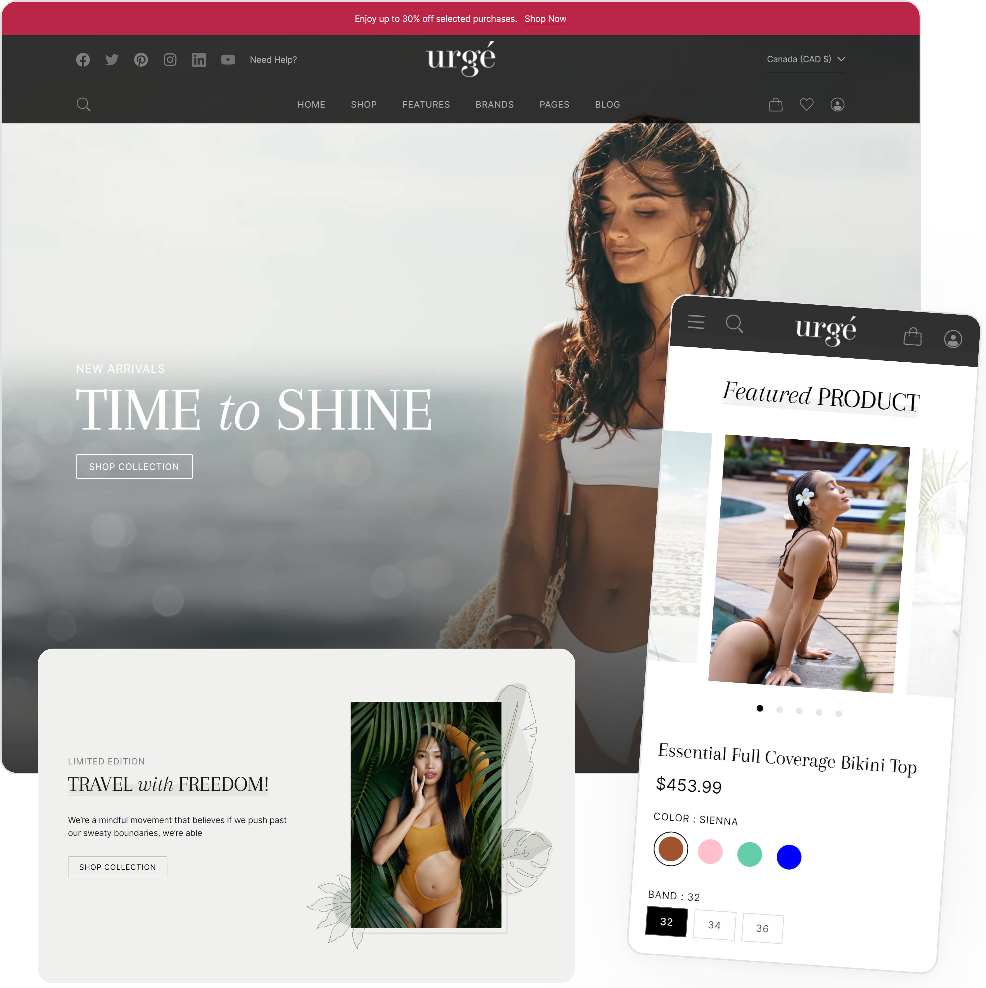
    Configure Featured product

    1. Navigate to Customize theme.At the top of the page, click the dropdown to select the Home page template.
    2. Select Featured product from the left menu.
    3. Click Add block to add blocks.
    4. Customize this section by using the settings described in the following table:

    Setting

    Description

    Heading

    Enter a heading for the Featured product.

    Product

    Select the product to be featured.

    Thumbnail position

    Select the thumbnail position: 

    • Next to media left
    • Below media
    • Next to media right

    Custom CSS

    Add custom CSS to this section only. More information.

    Add block

    Payment Option

    Heading

    Select a collection to add to the list.

    image

    Select an image for the product. 

    Price

    Enable availability

    Check this box to enable the product availability.

    Variant picker

    Type

    Choose between Pills/Dropdown.

    Buy buttons

    Show dynamic checkout buttons

    Check this box to enable dynamic checkout buttons. Using the payment methods available on your store, customers see their preferred option, like PayPal or Apple Pay. Learn more

    Show quantity box

    Check this box to enable the quantity box.

    Enable pickup availability feature.

    Check this to enable the pickup availability feature. Learn how to setup this feature here

    Product type & tag

    Enable type

    Check this box to enable the product type

    Enter anyone specific tag

    Enter a specific tag for the product.

    Sales countdown

    Heading

    Enter heading text  for the sales countdown.

    End date

    Enter an end date for the sales countdown. Format Dec 31, 2023

    Delivery countdown

    SVG icon

    Enter the SVG icon.

    Icon image

    Select an icon image. This is used as the icon image if SVG is not provided.

    HTML code

    Edit the HTML delivery date. The numbers can be edited but do not change the ids. 

    Sales point

    SVG icon

    Enter the SVG icon.

    Icon image

    Select an icon image. This is used as the icon image if SVG is not provided.

    Heading

    Enter heading text  for the sales point.

    Text

    Enter text for sales point.

    Custom liquid block

    Custom liquid

    Enter the liquid template language code. For more information, refer to Shopify developers: Liquid reference.

    Collage with text

    Configure Collage with text

    1. Navigate to Customize theme.At the top of the page, click the dropdown to select the Home page template.
    2. Select Collage with text from the left menu.
    3. Customize this section by using the settings described in the following table:

    Setting

    Description

    Background color

    Select a background color for the collage section.

    Text color

    Select the text color for the collage section.

    Tagline color

    Set the color for the tagline.

    Content

    SVG

    Add an SVG image for the collage.

    Icon image

    Add an icon image for the collage.

    Tagline

    Add a tagline to display in the collage.

    Heading

    Enter text for the collage heading.

    Heading link

    Enter the URL for the heading CTA.

    Text

    Enter the collage text.

    Image 1 - Image 8

    Enable

    Check this box to enable the specific image (repeat for all 8 images).

    Image

    Select an image to add to the collage (repeat for all 8 images).

    Custom CSS

    Add custom CSS to this section only. More information.

    Don't miss deals

    Configure the Don't miss deals section

    1. Navigate to Customize theme.At the top of the page, click the dropdown to select the Home page template.
    2. Select Don’t miss deals from the left menu.
    3. Customize this section by using the settings described in the following table:

    Setting

    Description

    Desktop background image

    Add desktop background image. Recommended format 1920 x 1080px .jpg

    Mobile background image

    Add mobile background image. Recommended format 420 x 680px .jpg

    Desktop height

    Configure the desktop height. Choose from:

    • 450px
    • 550px
    • 650px
    • 750px
    • Full screen

    Mobile height

    Configure the mobile height. Choose from: 

    • 250px
    • 300px
    • 400px
    • 500px
    • Full screen

    Heading

    Enter a heading for Don't miss deals section.

    Heading

    Select a color for the heading text.

    Timer color

    Set the timer text color.

    Month

    Select the month that the deal ends.

    Day

    Select the day that the deal ends.

    Custom CSS

    Add custom CSS to this section only. More information.

    Add content

    Image

    Select an image for the deal. Recommended format 300x400 px .jpg

    Choose product

    Select a product of the deal.

    Text

    Enter text to describe the deal.

    Button text

    Enter button text.

    This section is used to display a featured review/feedback from a happy customer.

    Configure Featured Testimonial

    1. Navigate to Customize theme.At the top of the page, click the dropdown to select the Home page template.
    2. Select Featured testimonial from the left menu.
    3. Click Add testimonial to add blocks.
    4. Customize this section by using the settings described in the following table:

    Setting

    Description

    Background color

    Select a background color for the Featured testimonials section.

    Text color

    Select the text color for the Featured testimonials section.

    Tagline color

    Set the color for the tagline.

    Dots color

    Set the dots color.

    Interval time

    Set the interval time between the quotes 6 - 10 seconds

    Tagline

    Add a tagline to display in the Featured testimonials section.

    Heading

    Enter text for the Featured testimonials heading.

    Image

    Select an image for the featured testimonial.

    Button text

    Enter the text for the button.

    Button link

    Enter the URL for the button CTA.

    Buttons

    Select a color for the buttons.

    Add testimonial

    Quote

    Enter the quote from the customer.

    Quote by

    Enter the name of the testimonial author.

    Custom CSS

    Add custom CSS to this section only. More information.

    Logos List

    This section will display the top brands or logo list.

    Configure Logos List

    1. Navigate to Customize theme.At the top of the page, click the dropdown to select the Home page template.
    2. Select Logos list from the left menu.
    3. Click Add image to add blocks.
    4. Customize this section by using the settings described in the following table:

    Setting

    Description

    Heading

    Enter text for the Logos list heading.

    Background color

    Select a background color for the Logos list section.

    Text color

    Select the text color for the Logos list section.

    Custom CSS

    Add custom CSS to this section only. More information.

    Buttons

    Select a color for the buttons.

    Add image

    Image

    Select a logo image to add to the list.

    Image link

    Enter the URL for the image CTA.

    Blog Posts

    Configure Blog Posts

    1. Navigate to Customize theme.At the top of the page, click the dropdown to select the Home page template.
    2. Select Blog posts from the left menu.
    3. Click Add block to add blocks.
    4. Customize this section by using the settings described in the following table:

    Setting

    Description

    Background color

    Select a background color for the blog posts section.

    Heading

    Enter text for the Blog posts heading.

    Tagline

    Enter tagline text for the blog posts section.

    Enable overlap

    Check this box to enable the title text to overlap the image.

    First blog full width

    Check this box to make the first blog full width.

    Blog

    Select a blog to add to the blog posts section.

    View all text

    Enter text for the button link to CTA.

    Custom CSS

    Add custom CSS to this section only. More information.

    Add block

    Image

    Select a logo image to add to the list.

    Image link

    Enter the URL for the image CTA.

    Heading

    Show date

    Check this box to display the blog post date.

    Show author

    Check this box to display the blog post author.

    Video banner

    Configure Video banner

    1. Navigate to Customize theme.At the top of the page, click the dropdown to select the Home page template.
    2. Select Video banner from the left menu.
    3. Customize this section by using the settings described in the following table:

    Setting

    Description

    Heading

    Enter text for the Video banner heading.

    Heading text size

    Set heading text size between 40 - 80 px.

    Text

    Enter text for Video banner section.

    Button label

    Enter a button label for the video banner section.

    Button link

    Enter the URL for the button CTA.

    Desktop text position

    Select the text position for the desktop: 

    • Top
    • Center
    • Bottom

    Desktop text position side

    Select the text position side for the desktop: 

    • Top
    • Center
    • Bottom

    Background video link

    Enter the URL for the background video. Supports YouTube, .MP4, and Vimeo. Not all features are supported by Vimeo.

    Desktop height

    Configure the desktop height. Choose from:

    • 450px
    • 550px
    • 650px
    • 750px
    • Full screen

    Mobile height

    Configure the mobile height. Choose from: 

    • 350px
    • 450px
    • 550px

    Text in box

    Check this box to enable the text in box feature.

    Background color

    Select the Background color:

    • Accent 1
    • Accent 2
    • Background 1
    • Background 2

    Box transparent

    Check this box to make the box transparent.

    Text color

    Select the color for the text in this section.

    Custom liquid

    This section is used to add the custom liquid code for any advanced customizations such as app snippets. Refer to Shopify developers: Custom liquid reference.

    Configure the custom liquid section

    1. Navigate to Customize theme.At the top of the page, click the dropdown to select the Home page template.
    2. Select Custom liquid from the left menu.
    3. Customize this section by using the settings described in the following table:

    Setting

    Description

    Custom liquid

    Enter the liquid template language code.

    For more understanding, refer to Shopify developers: Liquid reference.

    Background color

    Select background color for the entire section.

    Custom CSS

    Add custom CSS to this section only. More information.

    Google Map

    Configure Google map

    1. Navigate to Customize theme.At the top of the page, click the dropdown to select the Home page template.
    2. Select Google map from the left menu.
    3. Customize this section by using the settings described in the following table:

    Setting

    Description

    Background image

    Select a background image for the Google map. Recommended format 1920x1080 px .jpg

    Desktop height

    Configure the desktop height. Choose from:

    • 450px
    • 500px
    • 550px
    • 650px
    • 750px
    • Full screen

    Mobile height

    Configure the mobile height. Choose from: 

    • 250px
    • 300px
    • 400px
    • 500px
    • 600px
    • Full screen

    Tagline

    Enter tagline text for Google map section.

    Heading

    Enter heading for the Google map section.

    Address and hours

    Enter address and hours information in the text box.

    Add Google iframe code

    Enter Google iframe code in the box. For further information, please see Google maps documentation.

    Button 1

    Button text

    Enter a button label for the Google map.

    Button link

    Enter the URL for the button CTA.

    Button 2

    Button text

    Enter a button label for the Google map.

    Button link

    Enter the URL for the button CTA.

    Custom CSS

    Add custom CSS to this section only. More information.

    Note: You must add the "Google maps API" key in the map theme settings. Refer to the instructions below for a guide to integrating the Google Maps API key with your theme.

    Google Maps API Key Guide

    The Google Maps platform protects its products from unauthorized use by limiting API calls to authenticated users with proper credentials (i.e., an API key, this is a unique alphanumeric string that associates a Google billing account with the project and the specific API/SDK).

    The API key is a UID (unique identifier), which authenticates all requests associated with the project for usage and billing purposes.

    Note: Users must have at least one API key associated with the project.

    How to Create your Google Maps API key for the Google Maps platform

    Pre-Requisites

    A project with a billing account and the Maps JavaScript API are required before you can start. See Set up in Cloud Console for further information.

    1. Create a new: "Google cloud project" in the Cloud console: Create new project.
    2. Fill in the required details:
    3. Project name

      Use the default name or enter a customized name. You can change the project name at any time. For further information, see Identifying projects.

      Project ID

      Use the default or click "EDIT" to add a "Customized ID" that "Google APIs" use as a unique identifier for the project.

      Important Note: Once you have created the project, you cannot change the Project ID. With this in mind, select an ID you'll be comfortable using for the project's lifetime (do not include any sensitive information in "Project ID.").

      Billing account

      Select a billing account for the project. This option is only displayed if you have more than one billing account.

      Permissions

      Users must be a "Billing account administrator" or "Project billing manager" to associate a project with the billing account. For further information, see the billing access control documentation.

      Location

      If users have an organization to link the project to, click Browse and select it; otherwise, choose "No organization." For further details, see Creating and Managing Folders and Relationships between organizations, projects, and billing accounts.

    4. Click on the Create button.

    To create a Google Maps API Key:

    1. Open the Google Maps platform and navigate to the Credentials page. For further details, refer to Go to the Credentials page.
    2. Click on Create credentials -> API key. The API key-created dialog displays your newly created API key.
    3. Click on the Close button.

    This is the bottom section of your online store; share brief information about your store and add navigation menus for your site here to assist your users when navigating.

    Configure the footer

    1. Navigate to Customize theme.At the top of the page, click the dropdown to select the Home page template.
    2. Select Footer from the left menu.
    3. Customize this section by using the settings described in the following table:

    Setting

    Description

    Logo

    Use the logo selector option to set up an image to use as a logo. The recommended image dimensions are 210px x 40px (pixels).

    Custom logo width

    Adjust the slider Custom logo size to set a size for the logo image between 50px and 250px (pixels).

    Text

    Enter footer text.

    Show social media links

    Check this box to enable social media links in the footer.

    Enable payment icons

    Enable shopify payment icons in the footer.

    Bottom footer menu

    Select a bottom footer menu.

    Theme Settings

    Enter social media links in the boxes provided. 

    Custom CSS

    Add custom CSS to this section only. More information.

    Add blocks

    Footer menu

    Heading

    Add a heading block for the section title

    Footer menu

    Select the footer menu.

    Column width

    Set the column width percentage.

    Newsletter form

    Heading

    Add a heading block for the newsletter form.

    Subheading

    Add subheading text to the newsletter form.

    Text

    Add text to the newsletter form.

    Input background

    Select a color for the input background.

    Input text

    Select a color for the input text.

    Button background

    Select a color for the button background.

    Button text

    Select a color for the button text.

    Column width

    Select a width percentage for the column.

    Products

    Template-Default product

    The Default product page allows you to customize the appearance of products.

    1. Navigate to Customize theme.At the top of the page, click the dropdown to select the Home page template.
    2. Select Product page from the left menu.
    3. Customize this section by using the settings described in the following table:

    It has the following types of blocks:

    Setting

    Description

    Product information

    Configure the thumbnail position, enable zoom features, and also the Theme settings for configuration (color swatches), choose product, Text, gift image, gift message, gift wrapping, all products, size chart and Custom CSS for the template product information here.

    Product type & tag

    Enable the product type here and add a tag for the product.

    Heading

    Displays the product’s title; there are no customizable block settings available for this.

    Description

    Displays the product description on the page.

    Star rating

    Displays customer reviews and ratings. These reviews can be included by adding the Shopify reviews app. The star color, size, alignment product and badge text with no reviews can all be configured here.

    Product vendor

    Displays the name of the product vendor. There are no customizable block settings available for this.

    Price

    Add this block to display the product’s price like Sale and Compare at price. Product availability can be enabled/disabled here using the Enable availability check box.

    Sales countdown

    Enter heading text for the sales countdown and an end date for the sales countdown. Format Dec 31, 2023

    Variant picker

    Displays a variant picker for selecting variants of a product. Choose between Dropdown/Pills.

    Gift item

    Displays the gift option. There are no customizable block settings available for this.

    Buy buttons

    Displays the “Add to cart” and <>“Buy now”

    Select the checkbox "Show dynamic checkout button" to display a button with the user's preferred payment method, in addition to the "Add to cart" button.


    Select the “Show recipient form for gift card products” checkbox to enable gift card products.

    Delivery countdown

    Displays a countdown to delivery and an icon/svg file.

    Sales point

    Displays a sales pitch about a product, icon/svg, heading and text.

    Payment option

    Add an image and heading here for a payment option. 

    Complementary product

    Displays information for a product that pairs well with. To select complementary products, add the Search & Discovery app. Learn more

    Custom liquid block

    Custom liquid

    Enter the liquid template language code. For more information, refer to Shopify developers: Liquid reference.

    If a customer redirects to a product page from your store, related products will be displayed in the product recommendation section.

    Important Note

    The Product recommendation section is only available on the default product and feature pages.
    1. Navigate to Customize theme. At the top of the page, click on the dropdown menu to select the Products -> Default product template.
    2. Select Product page from the left menu.
    3. Customize this section by using the settings described in the following table:

    Setting

    Description

    Tagline

    Add tagline text to be displayed for the product recommendations.

    Heading

    Add title text to be displayed for the product recommendations.

    Recently Viewed

    If a customer redirects to a product page from your store, related products will be shown in the product recommendation section.

    Important Note

    The Recently Viewed section is only available on the default product and feature pages.
    1. Navigate to Customize theme. At the top of the page, click on the dropdown menu to select the Products -> Default product template.
    2. Select Recently Viewed from the left menu.
    3. Customize this section by using the settings described in the following table:

    Setting

    Description

    Tagline

    Add tagline text to be displayed for the product recommendations.

    Heading

    Add title text to be displayed on the Recently Viewed section.

    Enable quick shop feature

    Check the box to enable the quick shop feature.

    Custom CSS

    Add custom CSS to this section only. More information.

    Create a Variant
    1. Select a Product.
    2. Locate Variant panel.
    3. Select the Add options like size or color.
    4. Customize this Variant by configuring the following settings:

    Setting

    Description

    Option name

    Select one of the options:

    • Size
    • Color
    • Material
    • Style

    Option values

    Enter the option value(s). Multiple values can be added here.

    Click Done when finished.

    Select variant image

    Select an image or add an image, then click Done.

    Actions

    Edit price

    Either enter a price to apply to all variants or enter a price for the selected variant. 


    If you select multiple variants you can edit them all together.


    Click Done to save.

    Delete variant

    Deletes the selected variant. This cannot be undone.

    Edit SKU

    Add/edit the SKU(s) for the selected variant.If you select multiple variants you can edit them all together.


    Click Done to save.

    Edit barcode

    Add/Edit the barcode(s). If you select multiple variants you can edit them all together.

    Edit HS code

    Add/Edit the Harmonized System code(s). If you select multiple variants you can edit them all together.

    Edit country/region of origin

    Select a Country/Region of origin for the variant(s). 


    If you select multiple variants you can edit them all together.


    Click Done to save.

    Edit locations

    Select the stock location(s) for the variant(s).


    Click Done to save.

    Options

    Add image

    Click Add image or Choose existing to populate the image for the variant.

    Pricing

    Price

    Select a currency and enter a price (by default the price of the original product is listed).

    Compare at price

    Select a currency and enter a compare at price (by default the compare at price of the original product is listed).

    Charge tax on this product

    Check the box if the product is subject to sales tax.

    Cost per item

    Enter a cost per item (customers won’t see this).

    Inventory

    SKU

    Enter a SKU for the variant. 

    Barcode

    Enter a Barcode for the variant.

    Track quantity

    Optional: Check the track quantity box.

    Quantity

    Edit locations

    Select the location(s) where the variant is stocked.

    Shipping

    Physical Product?

    Configure the Shipping - Check the box if the product is a physical product.

    Weight

    Enter a weight and select the unit of measurement: 

    • lb
    • oz
    • kg
    • g

    Apply weight to all variants for “variant name”

    Check this box if all variants are the same weight.

    Include customs information for international shipping

    Customs Information

    Country/Region of origin

    Enter customs information for the product - Country of manufacture.


    HS (Harmonized System code)

    Enter customs information for the product - HS (Harmonized System) code.

    Digital product or service

    Select this option if the product is digital or a service (i.e. no shipping required).

    Add Media to a Variant
    1. Locate the Media section of the Product
    2. Click the Add button or the Add from URL link and select the video to be added.
    3. Locate the variant id in the url as shown in the screenshot below:
    4. Open the video editor by clicking on the video.
    5. Add the variant id to the video alt text using the following format: variant= The example in the screenshot above would be: variant=44339392938290
    Add Gift Wrapping block
    1. Navigate to Customize theme. At the top of the page, click on the dropdown menu to select Products -> Default Product.
    2. Select Product information.
    3. Select Theme Settings from the menu on the left.
    4. Scroll down and expand the Gift Wrapping menu option.
    5. Click the Enable gift wrapping option to select it.
    6. Click the All products box to select it.
    7. Scroll down to the Text block, click the Change drop-down menu item and select Change product.
    8. Type gift in the search box at the of the menu, then select Gift wrappingfrom the list.
    9. Scroll down to Gift image and click the image button.
    10. Either upload an image or choose an existing image to represent your gift wrapping option.
    11. Click the Save button on the top right.

    The Gift wrapping feature is now enabled, but it will also appear as a standalone product. This can be hidden:

    1. Exit the Theme settings and return to your store.
    2. Select Products from the menu on the left.
    3. Scroll down and select the Gift Wrapping Product from the list.
    4. Locate the Tags field in the Product organization section on the right of the screen.
    5. Type is and is-hidden will appear. Check the box next to it to add this tag to the product.
    6. Gift wrapping will now only appear as an option on products that have the feature enabled (the Gift wrapping product will not be visible in your store as a standalone product).
    Add Gift Wrapping for specific products only

    Enable the Gift Wrapping option for specific products

    1. Navigate to Customize theme. At the top of the page, click on the dropdown menu to select Products -> Default Product.
    2. Select Product information.
    3. Select Theme Settings from the menu on the left.
    4. Scroll down and expand the Gift Wrapping menu option.

      Important Note

      If Gift wrapping is not enabled refer to the section above “Add Gift Wrapping block”
    5. If All products is selected, click in the box to de-select it.
    6. Click in the Specific products only box.
    7. Click the Save button on the top right.

    Add Gift Wrapping for a specific product

    1. Navigate to Products, Click on a product that you want to add gift wrapping to.
    2. Scroll down to the bottom of the menu on right and click the Tags field, select the “gift_wrapping” tag in the product tag section.
    3. Click the Save button on the top right.
    4. The front-end will now update to reflect this change.

    Important Note

    If you have any issues or need help with this feature please contact us, we are here to help you.
    Exclude Gift Wrapping for specific products

    Exclude the Gift wrapping option for specific products

    1. Navigate to Customize theme. At the top of the page, click on the dropdown menu to select Products -> Default Product.
    2. Select Product information.
    3. Select Theme Settings from the menu on the left.
    4. Scroll down and expand the Gift Wrapping menu option.
    5. Click in the Exclude specific products box.
    6. Click the Save button on the top right.

    Exclude Gift wrapping for a specific product

    1. Navigate to Products, Click on a product that you want to add gift wrapping to.
    2. Scroll down to the bottom of the menu on right and click the Tags field, select the “no-gift_wrapping” tag in the product tag section.
    3. Click the Save button on the top right.
    4. The front-end will now update to reflect this change.

    Important Note

    If you have any issues or need help with this feature please contact us, we are here to help you.
    Add Color Swatch

    You can customize the color swatches used either using Hex Code or an image.

    1. Navigate to Customize theme.
    2. Select Theme Settings from the menu on the left.
    3. Scroll down and expand the Color Swatch menu option.
    4. Enter the name of the color, followed by the hex value for the color OR the file name of the image to be added.
    5. If you wish to add an image, 128x128 PNG or JPEG is recommended. The image must be uploaded first.
      1. Click the Exit button on the top left to return to the home page.
      2. Navigate to Content.
      3. Select Files from the menu on the left.
      4. Click the Upload Files button.
      5. Select the file to be uploaded (repeat as necessary).
      6. The uploaded files will appear in the list of files once the upload has been completed and automatically appear on the product page(s) in the available color swatches. For example, if there’s a product with a Navy color, once the image navy.png has been uploaded, the Navy color swatch will appear on the product page automatically.

    Important Note

    • Only one entry per line.
    • The file extension is required when using a file.

    Example:

    Collections

    Template-Collection list

    This page will list all the products in your collection list. Users can choose to sort or filter the product listings on this page using various options.

    1. Navigate to Customize theme. At the top of the page, click on the dropdown menu to select the Collection -> Default collection template.
    2. Select Collection list from the left menu.
    3. Customize this section by using the settings described in the following table:

    Setting

    Description

    Image

    Select an image for the collection. Recommended format 1920x450 px .jpg

    Heading

    Enter a heading for the collection list page.

    Description

    Enter a description for the collection list page.

    Show collection title

    Check this box to show/hide the collection title on the page.

    Show collection description

    Check this box to show/hide the collection description on the page.

    Text color

    Set the text color for the Collections list.

    Content width

    Select a content width between 100px - 1500px.

    Product grid

    Enable sorting

    Select this checkbox to enable sorting on the page.

    Pagination

    Select either Infinite scroll/Pagination

    Product Card

    Set the number of products per row minimum 2, maximum 4. 

    Custom CSS

    Add custom CSS to this section only. More information.

    Pages

    Contact

    Customize the Contact

    1. Navigate to Customize theme. At the top of the page, click on the dropdown menu to select the Home page
    2. Select Contact form from the left menu. (Use the +Add Section if its not in the menu already)
    3. Customize this section by using the settings described in the following table:

    Setting

    Description

    Heading

    Add Contact section heading text.

    Background color

    Select a background color for the contact page.

    Text

    Select a text color for the contact page.

    Custom CSS

    Add custom CSS to this section only. More information.

    Add block

    Name

    Field title

    Add field title for the contact name.

    Width on desktop

    Select the width on desktop:

    Half width/Full width

    Make field required

    Check this box to make this a required field.

    Email

    Field title

    Add Field title for email.

    Width on desktop

    Select the width on desktop:

    Half width/Full width

    Phone

    Field title

    Add Field title for phone.

    Width on desktop

    Select the width on desktop:

    Half width/Full width

    Make field required

    Check this box to make this a required field.

    Message

    Field title

    Add Field title for message.

    Width on desktop

    Select the width on desktop:

    Half width/Full width

    Multi line text

    Field title

    Add field title for the multi-line text block.

    Width on desktop

    Select the width on desktop:

    Half width/Full width

    Make field required

    Check this box to make this a required field.

    Single line text

    Field title

    Add field title for the single-line text block.

    Width on desktop

    Select the width on desktop:

    Half width/Full width

    Make field required

    Check this box to make this a required field.

    Faq

    Customize the Faqs

    1. Navigate to Customize theme. At the top of the page, click on the dropdown menu to select the Home page
    2. Select Faq from the left menu. (Use the +Add Section if its not in the menu already)
    3. Customize this section by using the settings described in the following table:

    Setting

    Description

    Heading

    FAQ section heading text.

    Text

    Add text for the faq to show as a description.

    Custom CSS

    Add custom CSS to this section only. More information.

    Add block

    Heading

    Add FAQ heading text.

    Content

    Add a faq box for the question and answer.

    Blogs

    Template-Default blog

    Published blogs can be viewed and read from this page.

    1. Navigate to Customize theme. At the top of the page, click on the dropdown menu to select the Blog -> Default blog.
    2. Select Default blog from the left menu. (Use the +Add Section if its not in the menu already)
    3. Customize this section by using the settings described in the following table:

    To understand more about blogs, please refer to Shopify blog posts.

    Setting

    Description

    Custom CSS

    Add custom CSS to this section only. More information.

    It has the following types of blocks:

    Block

    Description

    Heading

    Add this block to display the article title. You can show/hide the date and author name from this block.

    Excerpt

    Add this block to display the article excerpt.

    Link

    Add this block to display the Read more link.

    Show category in sidebar

    Add this block to display categories in the sidebar. This block only works if the sidebar is enabled.

    Show recent articles in sidebar

    Add this block to display recent articles in the sidebar. This block only works if the sidebar is enabled.

    Blog posts

    Template - Default blog post

    This is the page where published blogs can be viewed and read.

    1. Go to Customize theme. At the top of the page, click on the dropdown menu to select the Blog posts -> Default blog posts template.
    2. Select Blog post from the left menu. (Use the +Add Section if its not in the menu already)
    3. Customize this section by using the settings described in the following table:

    To understand more about blogs, please refer to Shopify blog posts.

    Block

    Description

    Featured Image

    Add this block to display the article image on the page.

    Heading

    Add this block to display the article title. You can show/hide the article publish date and author name from this block.

    Content

    Add this block to display article content.

    Social share buttons

    Add this block to display the social share icons.

    Show related articles

    Add this block to show/hide the filtered list of similar articles.

    Cart

    Template-Cart

    This page shows all the products that the customers have selected to purchase.

    1. Navigate to Customize theme. At the top of the page, click on the dropdown menu to select the Cart template.
    2. Select Main cart from the left menu. (Use the +Add Section if its not in the menu already)
    3. You can edit cart settings from the theme settings tab.

    Checkout

    Checkout can’t be edited using sections. To customize your checkout, go to theme settings.

    Password page

    Template-Password

    Use the settings to customize the password page.

    1. Go to Customize theme. Click on the top dropdown menu to select the Others-> Password template.
    2. Select “Password page” from the left menu.
    3. Customize this section by using the settings described in the following table:

    Setting

    Description

    Logo

    Use the logo selector option to set up an image to use as a logo.

    • To add an image, click on the Select image button, upload an image or select an image file from the store’s file library.
    • To replace an image, click on Change -> Change image and select a new image.
    • To remove an image, click on Change -> Remove image.
    • Select “Add alt text link,” and add a brief text about the image into the Image alt text box. For further information, refer to Shopify help: Adding alt text to media

    Custom logo width

    Adjust the slider Custom logo width to set a size for the logo image inside the section between 50px and 250px (pixels).

    Custom CSS

    Add custom CSS to this section only. More information.


    Theme Support Policy

    Theme Support Policy


    As per our Theme Support Policy, Marketplace Solutions supports all bug fixes and answers any merchant technical questions regarding our theme within two business days.


    As a Theme Partner, Marketplace Solutions is responsible for supporting merchants who use our theme. Being merchant-focused and providing quality support is essential to the success of our  theme.


    Merchant support requests are submitted through our contact form, which is linked to the Shopify Theme Store and our theme documentation.


    We keep our documentation up to date, as changes occur within Shopify we update our theme. As we support merchants using our theme, we identify any gaps in our theme documentation and make updates as necessary.


    When we submit our theme to the Shopify Theme Store for an update, the theme will have a version number and release notes that highlight the main features of the new version.


    Our theme documentation includes an FAQ section and other relevant information that could help to navigate and address potential questions that merchants might have.


    Merchant Support


    We assist merchants with all theme related questions and reply to all support requests within two business days. If there are technical issues with our theme such as broken layout, dead link or logical errors, then we are responsible for fixing within a timely manner and we fix all critical bugs immediately.


    Custom code tutorials in our documentation such as demo setup instructions, theme customizations and theme updates are supported.


    Still need help?  Browse FAQ’s or Contact


    Support Hours:

    Monday - Friday 

    9:00am - 5:00pm EST (Excluding public holidays)

    Theme FAQ's

    Contact Theme Support

    We answer all questions regarding our theme within two business days.